There is a new show on The Game Show Network called Skin Wars.

It's all about body painting and making it into a reality TV show competition much in the same formula as Project Runway, and Face Off. I love seeing the art and skill in these shows and seeing idea's come to life so I tend to enjoy them. Also being into face and body painting myself I really enjoy seeing this type of art in the main stream.
Each week I will blog about each episode, it's highlights, artistic challenges, and what I would have done if given the same challenge.
SPOILER ALERT!!!!
Season 1 Episode 3
Mini Challenge:
In teams of 2, paint one full side of your model to represent a yin-yang theme.
Natalie & Angela:
Theme: Happy and Sad
This one was great! Not only was it happy and sad but it was also black and white vs color! Very creative, this really impressed me. On the technical side, the painting was a little harsh and wasn't the cleanest but these girls nailed everything else!
Shannon & Felle:
Fire and Ice
Wow! This one was amazing! The detail in those fish was amazing. Loved how it wasn't straight down the middle but more of a curve. The colors are very visually appealing and are very complimentary. LOVED how the fire Coy fish in the middle of the models chest was like a circle. I like the ice/water side a bit better because it has more little things in it like lotus petals and stuff, and i feel the fire side needed a little something more. But with only two hours to paint it was defiantly amazing!
Mythica & Dutch:
Theme: Heaven and Hell
I liked the angels and the demons, lots of high detail on the demons, but the angels seemed muddy again, I felt they needed more 'pop' to really stand out. I liked the little story in the middle of love. However I didn't know what was with the veil, that kind of killed it for me and the cut off at the waste was a little boring. The face could have been more interesting.
Note: They really glossed over Dutches work at the end and barely even showed it! WTF?
Gear & Nicole:
Theme: Heaven and Hell
This one was really good. The little extras with the props really added more dimension to the piece, loved the feathers and the demon wings and horn. Nicole's side OF COURSE has glitter, but i think this time it works for the piece. Gears side has more pop this time, and I'm glad to see none of the detail is lost in soft shades of red. This is his 2nd fire style piece and i get the feeling he's playing it safe with painting with fire as he's pretty good at it.
My Idea:
Theme: Life and Death
I would suggest this theme to which ever partner I had.
The idea's in my head revolve around a forest. On one side there is beautiful lush green leaves and flowers, little animals and such. Perhaps even the face of 'mother nature' or a goddess of life in a tree of life. It's bright, it's daytime light, and the feeling is calm. On the other side would be nightfall, dead trees, the skeleton of an animal, fallen leaves, and the face of 'death' or a grim reaper. It wouldn't be a straight line to separate them either but rather a curve much like Shannon and Felle's piece.
My Top 2
1st - Shannon & Felle
This was really the most visually appealing. It nailed the concept of yin-yang, the colors were great, the details were great, it wasn't a straight line for a cut off point, AND those fish being on either side in the middle really made this one stand out.
2nd - Natalie & Angela
Even though it wasn't the most detailed I felt that the 'style' they went for really worked for the happy sad theme they chose, as it felt really theatrical. Also loved the creativity involved and the reveal with the hands. But also that it wasn't just happy and sad, it was also monochromatic VS colored!
My Bottom 2:
3rd - Gear & Nicole
While i really liked the colors and the use of props and embellishments, it felt a little too plain in some areas, the straight line down the middle was a bit boring, but it was over all still pulled off nicely.
4th - Mythica & Dutch
Sorry guys, but the simple face and veil killed it for me. The colors didn't really pop either, and the split at the waist was super boring. What i saw of Dutches work looked nice and detailed, but Mythica's upper part again looked muddy. Needed more contrast and i felt her entire side brought down the piece. I think Dutch should have gone in after an added some contrast with some black to give those angels some pop!
Notes:
I found it interesting that when they were picking partners it again choose to show a clip of Dutch saying he knew Mythica would pick him, and that he's cool with her being "subservient". After reading some comments on the SkinWars face book page it seems clear that the producers goal to portray him as an arrogant douche is working wonders on those who easily buy into what ever they are fed. Can we just be honest... EVERYONE knew she was going to pick Dutch! I knew it, you knew it, the other contestants knew it. Why? Because we all know he's one of the strongest painters, AND they have worked together before. No surprise. Just like how the next person to choose a partner (Nicole) picked Gear, because he's one of the next strongest painters, it's kind of obvious.
As for her being subservient to him, he's got a point, perhaps a poor choice of wording but they both know who the stronger painter is. Mythica doesn't seem like the type of person to fill herself with pride and think she's the best of the best when she knows she is still learning, she knows when her work isn't up to par and she can take criticism for the most part. But she also beats up on herself too much for her short comings, - she is some times her own worst critic, and her own biggest cheerleader. Any way, so as for her taking the lead from Dutch on this one, that's also probably part of the reason she chose him. She knows he's going to take the lead and seemed totally cool with it. Why this is lost on the people making comments on facebook is anyone's guess.
Finally I felt it was a bit lame, to show Nicole and Gear getting excited about their heaven and hell idea only to shortly after show Dutch have the same idea like he was ripping them off. In truth each team had no idea what the other team was going to do, but the way this was put together made it look like he was being a copy cat, or unoriginal.
Felle and Shannon had an interesting exchange about learning techniques, and Shannon wanted to learn certain things from him. Learning is great, but I'm with Felle on this one, now is not the time woman!
Main Challenge:
The strongest piece of each decade will be chosen, and the bottom piece is at right of going home.
Nicole:
20's
Really? The 20's circus? I know that type of performance art is her favorite thing ever, but i really wish she stuck to more actual clothing and not costumes. While it was done well I do not think it fit the criteria.
Gear:
20's
I really liked this one! The lace on the gloves was great, the pearls were great, and screw what the judges said I actually thought the tights were great too. Unlike the others he didn't go for a skin tight look! He went for the illusion of a dress where there was none. Good Job!
Dutch:
Mythica:
80's
Again with the muddy colors. I'm sorry but i didn't like this one at all, and i don't think it should have placed over Dutch. I don't like to take away or down play anyone's 'win' but this wasn't really 80's to me. This was an 80's stereotype stage costume. The wrinkles didn't seem right, the jacket was muddy looking, and the tights had messy stripes that were not clean at all. It felt very simple.
Allow me to illustrate what i mean by an 80's stereotype.
Felle:
Shannon:
50's
Noooooo! Shannon why?! I like zombies as much as the next person (if not more), but not for this challenge. This was self sabotage. While i liked the inclusion of the bra, and the illusion of the hanging jacket in the back, this really was more 1940's then it was 50's. Sorry! Loved the winkles and the depth. I really would have liked to see all this without the zombie to hide what i think was one of her better pieces technically so far.
Natalie:
70's
Very cool! Loved the use of props! Also loved the suspenders and her little painted thumb trick. The judges tried to poo on it saying it didn't line up - hogwash! That was brilliant! Only thing i would have liked to see more of was wrinkles! She could have blown it out of the park if her wrinkles were just a bit more there.
Angela: 20's
I really liked this one! The lace on the gloves was great, the pearls were great, and screw what the judges said I actually thought the tights were great too. Unlike the others he didn't go for a skin tight look! He went for the illusion of a dress where there was none. Good Job!
Dutch:
80's
Holy hell again! This was.... incredible. Everything was just so spot on, not just for the look of clothing but the actual 80's style. That shirt is right out of an episode of Degrassi Jr. High. The hair, the shirt, the leg warmers, the fish net sleaves, the pink bra; the freaking runs in the stockings! this was great! What I liked the most was the illusions he made with the skirt and the shoulder of the skirt. The blending there was impeccable, you couldn't even tell that it was a add on. Technically I loved the back panel too, the folds were spot on, and it was a band name style panel. LOVE! He had just enough neon that it wasn't over the top. My only criticism is that the wrinkles are a little too stylized. They are very comic book like with the depth and highlight, i think they could have been a bit more subtle. But that said, at least he had wrinkles in the first place, where are most of the others has nothing for texture.
Holy hell again! This was.... incredible. Everything was just so spot on, not just for the look of clothing but the actual 80's style. That shirt is right out of an episode of Degrassi Jr. High. The hair, the shirt, the leg warmers, the fish net sleaves, the pink bra; the freaking runs in the stockings! this was great! What I liked the most was the illusions he made with the skirt and the shoulder of the skirt. The blending there was impeccable, you couldn't even tell that it was a add on. Technically I loved the back panel too, the folds were spot on, and it was a band name style panel. LOVE! He had just enough neon that it wasn't over the top. My only criticism is that the wrinkles are a little too stylized. They are very comic book like with the depth and highlight, i think they could have been a bit more subtle. But that said, at least he had wrinkles in the first place, where are most of the others has nothing for texture.
Mythica:
80's
Again with the muddy colors. I'm sorry but i didn't like this one at all, and i don't think it should have placed over Dutch. I don't like to take away or down play anyone's 'win' but this wasn't really 80's to me. This was an 80's stereotype stage costume. The wrinkles didn't seem right, the jacket was muddy looking, and the tights had messy stripes that were not clean at all. It felt very simple.
Allow me to illustrate what i mean by an 80's stereotype.
This is how people actually dressed in the 80's


This is how Rick James Dressed in the 80's

That's called a stage costume.
This is how Rick James Dressed in the 80's
That's called a stage costume.
Felle:
50's
Totally happy days! Loved the poodle, that was too funny! Sure the back was blank but it was still good, it felt like the 50's and he really pulled it off. Though i would have liked to see more wear and wrinkles in the jacket.Shannon:
50's
Noooooo! Shannon why?! I like zombies as much as the next person (if not more), but not for this challenge. This was self sabotage. While i liked the inclusion of the bra, and the illusion of the hanging jacket in the back, this really was more 1940's then it was 50's. Sorry! Loved the winkles and the depth. I really would have liked to see all this without the zombie to hide what i think was one of her better pieces technically so far.
Natalie:
70's
Very cool! Loved the use of props! Also loved the suspenders and her little painted thumb trick. The judges tried to poo on it saying it didn't line up - hogwash! That was brilliant! Only thing i would have liked to see more of was wrinkles! She could have blown it out of the park if her wrinkles were just a bit more there.
70's
Woot! Disco! Loved the pants, loved the shirt with the colors and the disco ball. Even the words that were written because that is TOTALLY what they did back then. It was flashy and colorful, and groovy. People wore words on their clothes all the time... except for Disco Stu... everyone knows Disco Stu doesn't advertise.

My Idea:
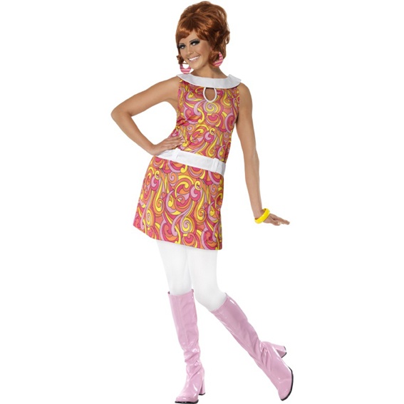
Ultimately I would probably go for something like the 60's Mod style
My Top 4
1st - Dutch
Given that the only complaint was the the wrinkles were a bit 'too' stylized, this one made up for it on every other level. The amount of detail and nostalgia in this piece was perfect and complimentary.
2nd - Natalie
Lots of skin coverage and a perfect 70's high school girl. Loved the trick with the suspenders.
3rd - Felle
Hit the 50's on the head! Very cute and fit the theme nicely
4th - Gear
Loved the dress. Nice details, great lace, use of props, and wrinkles in the 'fabric'. This one said 20s to me, that model was a total flapper!
My Bottom 4:
5th - Nicole
Not enough skin coverage, and it really was more of a costume to me. I felt it missed the mark where the theme of the challenge was concerned but was still a well painted piece.
6th - Angela
This one said Disco Era to me. Though perhaps a bit risky leaving so much skin showing. Too much fun, but ultimately I felt that Natalie's was better.
7th - Shannon
This one makes me sad to put here because honest it really was a great painting, the detail was great, and it was all the little things that made me love it. But the clothing style didn't match the 50's era even though it was well painted, and excuse the pun but.... the zombie killed it.
8th - Mythica
*sigh* again with the muddy colors. This one for me at the potential to be so much better but it really felt rushed, and not enough time was spent on details like wrinkles, shadow and highlights.
Note: This was sticking with the criteria that there can only be one top and one bottom from each decade.
Wrapping up:
I can't believe they put Dutch in the bottom 4!! I was ranting all day after seeing this. It really just blew my mind and I think he's right that she are trying to rattle his cage, and create drama. After seeing the things the show is posting in the Skin Wars face book page, I have no doubt believing that they intentionally manipulated things it order to get a reaction out of him. I don't think that Angela should have been sent home, I really thought it was going to be Shannon or Mythica. Starting to get a bit disappointed with this show and it's ever changing criteria.
No comments:
Post a Comment